From Bioblast

- high-resolution terminology - matching measurements at high-resolution
Scaling - DatLab
Description
Scaling a graph in DatLab provides flexibility to vary the display of the plots and create Graph layouts. It allows viewing a data plot in differently scaled graphs, zooming the signal and time scales, and scrolling along the axes of the graph provide maximum information on the current experiment. This does not influence the format of stored data. Different ranges for the axes change the appearance of data dramatically. It is highly recommended to use reference layouts.
»Compare: Select plots - DatLab.
Abbreviation: F6
Reference: MiPNet19.18C DatLab 6: Guide

MitoPedia O2k and high-resolution respirometry: DatLab
Graph \ Scaling
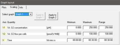
- Select graph Pull down to select any of the defined graphs.
- Minimum Defines the minimum axis position (suppression) for the display of data at a constant range.
- Maximum Defines the maximum axis position for the display of data at a constant range.
- Range Define the range of the Y1 axis (left), Y2 axis (right) and X axis (Time). Select a predefined Graph layout from the options in the pull down menu. Edit the Graph layout name by a left-click on the name, and left-click Save to save the entire graph layout.
- Apply to Graph 1 The scaling defined for Graph 2 is applied to Graph 1.

Arrow keys
Example
- Y1-axis: Concentration [nmol/ml=µM]; a range of 200 and Start at 0 is chosen after calibration to show the oxygen concentration in the full range (0-200 µM) without amplification.
- Y2-axis: Flux [pmol×s-1×ml-1]; Range of 300 and Start at 0 shows flux from 0 to 60 pmol×s-1×ml-1 when the oxygen signal is calibrated [µM].
- X-axis: Range 1:00 h and Start at 35 min presents data starting at 35 min, over a 1:00 h time interval from 35 to a maximum of 1:35 h.